





배경 속성

배경을 제어하는 속성
•
배경 속성 종류
•
배경 그라데이션 함수
•
기본 예시 코드
•
배경 속성 응용
◦
배경 고정 스크롤
◦
텍스트 마스크
◦
이미지 마스크
배경 속성 종류
속성 | 설명 |
background-color | 배경색을 설정합니다. |
background-image | 배경 이미지 파일을 설정합니다. |
background-repeat | 배경 이미지를 반복할지 여부를 설정합니다. |
background-position | 배경 이미지의 위치를 설정합니다. |
background-size | 배경 이미지의 크기를 조정합니다. |
background-attachment | 배경 이미지의 스크롤 동작을 설정합니다. |
background | 위의 모든 배경 속성을 한 번에 설정할 수 있습니다. |
배경 그라데이션 함수
함수 | 설명 | 주요 속성 |
linear-gradient | 선형 그라데이션 | direction (각도, 방향), color-stop (색상 및 위치) |
radial-gradient | 방사형 그라데이션 | shape (원형, 타원형), size (크기), position (위치), color-stop (색상 및 위치) |
conic-gradient | 원뿔형 그라데이션 | from angle (시작 각도), at position (중심 위치), color-stop (색상 및 위치) |
linear-gradient 함수
•
기본 구문: linear-gradient(direction, color-stop1, color-stop2, ...)
◦
direction: 그라데이션의 방향을 설정합니다. 각도(예: 45deg)나 방향 키워드(예: to right, to bottom)를 사용할 수 있습니다.
◦
color-stop: 그라데이션의 색상과 위치를 설정합니다. 색상값과 위치(예: #ff0000 0%, #0000ff 100%)를 지정할 수 있습니다.
radial-gradient 함수
•
기본 구문: radial-gradient(shape size at position, color-stop1, color-stop2, ...)
◦
shape: 그라데이션의 형태를 설정합니다. 원형(circle) 또는 타원형(ellipse)을 사용할 수 있습니다.
◦
size: 그라데이션의 크기를 설정합니다. 기본 크기(farthest-corner, closest-side, 등) 또는 사용자 정의 크기(50%, 20px 등)를 사용할 수 있습니다.
◦
position: 그라데이션의 시작 위치를 설정합니다. 위치 키워드(예: center, top left) 또는 좌표(예: 50% 50%)를 사용할 수 있습니다.
◦
color-stop: 색상과 위치를 설정합니다.
conic-gradient 함수
•
기본 구문: conic-gradient(from angle at position, color-stop1, color-stop2, ...)
◦
from angle: 그라데이션의 시작 각도를 설정합니다. 기본값은 0deg이며, 시계 방향으로 진행합니다.
◦
at position: 그라데이션의 중심 위치를 설정합니다. 위치 키워드(예: center) 또는 좌표(예: 50% 50%)를 사용할 수 있습니다.
◦
color-stop: 색상과 위치를 설정합니다.
기본 예시 코드
심플 예시
<!DOCTYPE html>
<html lang="ko">
<head>
<meta charset="UTF-8">
<meta name="viewport" content="width=device-width, initial-scale=1.0">
<title>배경 속성 예시</title>
<style>
.background-example {
background-color: lightblue;
background-image: url('background.jpg');
background-repeat: no-repeat;
background-position: center;
background-size: cover;
background-attachment: fixed;
}
</style>
</head>
<body>
<div class="background-example">
<h1>배경 속성 예시</h1>
<p>이 영역에는 배경 이미지와 색상이 적용됩니다.</p>
</div>
</body>
</html>
HTML
복사
모든 배경 속성 적용 예시

•
HTML
<!DOCTYPE html>
<html lang="en">
<head>
<meta charset="UTF-8">
<meta http-equiv="X-UA-Compatible" content="IE=edge">
<meta name="viewport" content="width=device-width, initial-scale=1.0">
<title>background</title>
<link rel="stylesheet" href="css/01_기본배경.css">
</head>
<body>
<div class="container">
<h1>My Room</h1>
<h2>background</h2>
<div class="inner back1"></div> <hr>
<!-- background-repeat -->
<h2>background-repeat: repeat-x;</h2>
<div class="inner back2"></div> <hr>
<h2>background-repeat: repeat-y;</h2>
<div class="inner back3"></div> <hr>
<h2>background-repeat: no-repeat;</h2>
<div class="inner back4"></div> <hr>
<!-- background-position -->
<h2>background-position: left;</h2>
<div class="inner back1 left"></div> <hr>
<h2>background-position: center;</h2>
<div class="inner back1 center"></div> <hr>
<h2>background-position: right;</h2>
<div class="inner back1 right"></div> <hr>
<h2>background-position: top left;</h2>
<div class="inner back1 top-left"></div> <hr>
<h2>background-position: top right;</h2>
<div class="inner back1 top-right"></div> <hr>
<h2>background-position: bottom left;</h2>
<div class="inner back1 bottom-left"></div> <hr>
<h2>background-position: bottom right;</h2>
<div class="inner back1 bottom-right"></div> <hr>
<h2>background-position: top center;</h2>
<div class="inner back1 top-center"></div> <hr>
<h2>background-position: center center;</h2>
<div class="inner back1 center-center"></div> <hr>
<h2>background-position: bottom center;</h2>
<div class="inner back1 bottom-center"></div> <hr>
<h2>background-color: mediumspringgreen</h2>
<div class="inner back4 mint"></div>
<h2>multi-back</h2>
<div class="inner classroom"></div>
<h2>multi-back</h2>
<div class="inner short"></div>
</div>
</body>
</html>
HTML
복사
•
CSS
.container { text-align: center; }
.inner {
width: 70vw; /* 보여지는 가로영역의 70% 비율로 적용 */
min-height: 70vh; /* 보여지는 세로영역의 70% 비율로 적용 */
margin: 0 auto;
border: 1px solid gray;
}
/* background-image */
.back1 {
background-image: url(../img/aloha.png);
}
/* background-size, background-repeat */
.back2 {
min-height: 190px;
background-image: url(../img/aloha.png);
background-size: 200px 190px; /* 가로 세로 */
background-repeat: repeat-x; /* x축으로만 이미지 반복 */
}
.back3 {
min-height: 600px;
background-image: url(../img/aloha.png);
background-size: 200px;
background-repeat: repeat-y; /* y축으로만 이미지 반복 */
}
.back4 {
background-image: url(../img/aloha.png);
background-repeat: no-repeat;
}
/* background-position */
.left {
background-repeat: no-repeat;
background-position: left;
}
.center {
background-repeat: no-repeat;
background-position: center;
}
.right {
background-repeat: no-repeat;
background-position: right;
}
.top-left {
background-size: 200px 190px;
background-repeat: no-repeat;
background-position: top left;
}
.top-right {
background-size: 200px 190px;
background-repeat: no-repeat;
background-position: top right;
}
.bottom-left {
background-size: 200px 190px;
background-repeat: no-repeat;
background-position: bottom left;
}
.bottom-right {
background-size: 200px 190px;
background-repeat: no-repeat;
background-position: bottom right;
}
.top-center {
background-size: 200px 190px;
background-repeat: no-repeat;
background-position: top center;
}
.center-center {
background-size: 200px 190px;
background-repeat: no-repeat;
background-position: center center;
}
.bottom-center {
background-size: 200px 190px;
background-repeat: no-repeat;
background-position: bottom center;
}
body {
background-image: url(../img/aloha.png);
background-size: 200px 190px;
background-position: top right;
background-repeat: no-repeat;
background-attachment: fixed; /* 배경 이미지 고정 */
}
.mint {
background-color: mediumspringgreen;
}
/*
이미지를 2개이상 적용
: (,) 기호를 기준으로 속성값을 사용
*/
/*
background-size
- px : (width height)
- cover : 이미지를 확대/축소해서 박스 가로 또는 세로 크기에 딱 맞게 채움
- contain : 이미지 전체가 보이도록, 가로/세로 비율을 유지하여 크기 조정
*/
.classroom {
background-image: url(../img/aloha.png), url(../img/classroom.jpg);
background-size: contain, cover;
background-repeat: no-repeat, no-repeat;
background-position: left, center;
}
/*
background 단축 속성
- background-color
- background-image
- background-repeat
- background-attachment
- background-position / background-size
* 중간의 개별속성 값이 누락되어도 적용가능
*/
.short {
background: url(../img/aloha.png) no-repeat scroll left bottom / contain,
url(../img/classroom.jpg) no-repeat scroll center center / cover;
}
CSS
복사
배경 속성 응용
•
배경 고정 스크롤
•
텍스트 마스크
•
이미지 마스크
배경 고정 스크롤
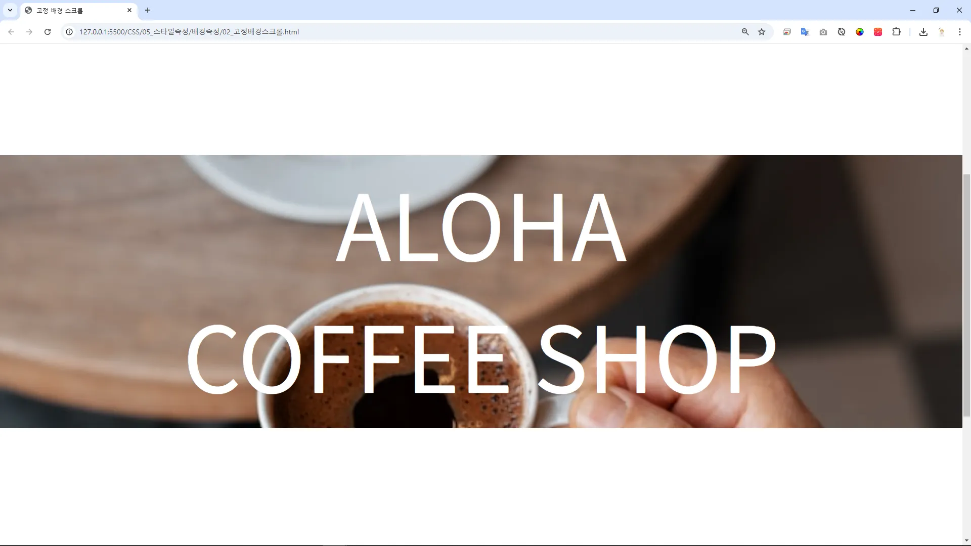
•
HTML
<!DOCTYPE html>
<html lang="ko">
<head>
<meta charset="UTF-8">
<meta name="viewport" content="width=device-width, initial-scale=1.0">
<title>배경 속성 예시</title>
<link rel="stylesheet" href="css/02_고정배경스크롤.css">
</head>
<body>
<div class="background-example">
<div class="content">
ALOHA <br>
COFFEE SHOP
</div>
</div>
</body>
</html>
HTML
복사
•
CSS
* { margin: 0; padding: 0; box-sizing: border-box; }
.background-example {
background-color: lightblue;
background-image: url('img/background.jpg');
background-repeat: no-repeat;
background-position: center;
background-size: cover;
background-attachment: fixed;
margin: 800px auto;
height: 600px;
color: white;
}
.content {
font-size: 200px;
margin: 0 auto;
text-align: center;
}
CSS
복사
텍스트 마스크
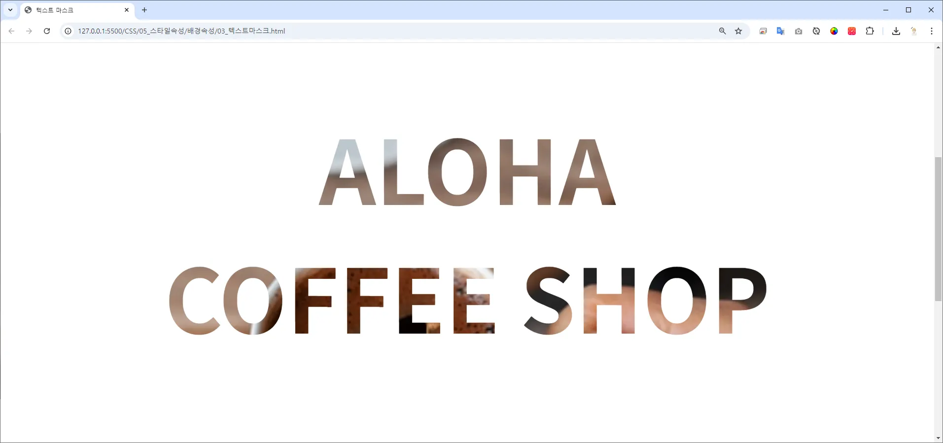
•
HTML
<!DOCTYPE html>
<html lang="ko">
<head>
<meta charset="UTF-8">
<meta name="viewport" content="width=device-width, initial-scale=1.0">
<title>텍스트 마스크</title>
<link rel="stylesheet" href="css/03_텍스트마스크.css">
</head>
<body>
<div class="wrapper">
<div class="background-example">
ALOHA <br>
COFFEE SHOP
</div>
</div>
</body>
</html>
HTML
복사
•
CSS
* { margin: 0; padding: 0; box-sizing: border-box; }
.background-example {
background-color: lightblue;
background-image: url('img/background.jpg');
background-repeat: no-repeat;
background-position: center;
background-size: cover;
background-attachment: fixed;
margin: 800px auto;
height: 800px;
color: white;
background-clip: text;
-webkit-background-clip: text;
color: transparent;
text-align: center;
padding: 50px;
font-size: 200px;
font-weight: bold;
}
/*
.wrapper {
background-color: black;
}
*/
CSS
복사
이미지 마스크
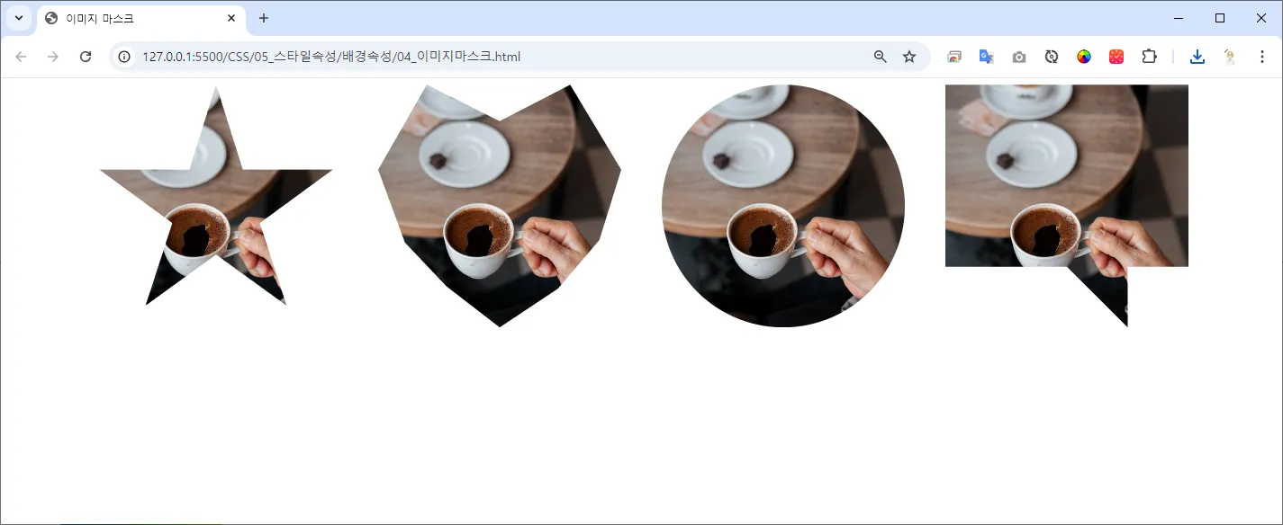


•
HTML
<!DOCTYPE html>
<html lang="ko">
<head>
<meta charset="UTF-8">
<meta name="viewport" content="width=device-width, initial-scale=1.0">
<title>이미지 마스크</title>
<link rel="stylesheet" href="css/04_이미지마스크.css">
</head>
<body>
<div class="wrapper">
<div class="mask star"></div>
<div class="mask heart"></div>
<div class="mask circle"></div>
<div class="mask message"></div>
</div>
</body>
</html>
HTML
복사
•
CSS
/* 전체 페이지 스타일 */
body {
margin: 0;
font-family: Arial, sans-serif;
display: flex;
justify-content: center;
align-items: center;
height: 100vh;
background-color: #f0f0f0;
}
/* 컨테이너 스타일 */
.wrapper {
display: flex;
justify-content: center;
align-items: center;
height: 100%;
width: 100%;
gap: 50px;
}
/* 이미지 마스크 적용 */
.mask {
width: 300px;
height: 300px;
background-image: url('../img/background.jpg');
background-size: cover;
background-position: center;
background-repeat: no-repeat;
}
.star {
clip-path: polygon(50% 0%, 61% 35%, 98% 35%, 68% 57%, 79% 91%, 50% 70%, 21% 91%, 32% 57%, 2% 35%, 39% 35%);
}
.heart {
clip-path: polygon(50% 15%, 79% 0, 100% 35%, 91% 64%, 74% 84%, 50% 100%, 28% 83%, 11% 65%, 0% 35%, 20% 0);
}
.circle {
clip-path: circle(50% at 50% 50%);
}
.message {
clip-path: polygon(0% 0%, 100% 0%, 100% 75%, 75% 75%, 75% 100%, 50% 75%, 0% 75%);
}
CSS
복사