




위치 속성

위치 설정 기준과 크기를 지정하는 속성
•
위치 속성 종류
•
위치 설정 기준
◦
static
◦
relative
◦
absolute
◦
fixed
◦
sticky
•
기본 예시 코드
•
위치 속성 활용
위치 속성 종류
속성 | 설명 | 기본 예시 코드 |
position | 요소의 위치 지정 방식 설정 | position: relative; |
top | 요소의 상단 위치 설정 | top: 20px; |
right | 요소의 우측 위치 설정 | right: 20px; |
bottom | 요소의 하단 위치 설정 | bottom: 20px; |
left | 요소의 좌측 위치 설정 | left: 20px; |
z-index | 요소의 쌓임 순서 설정 | z-index: 10; |
위치 설정 기준
•
static
•
relative
•
absolute
•
fixed
•
sticky
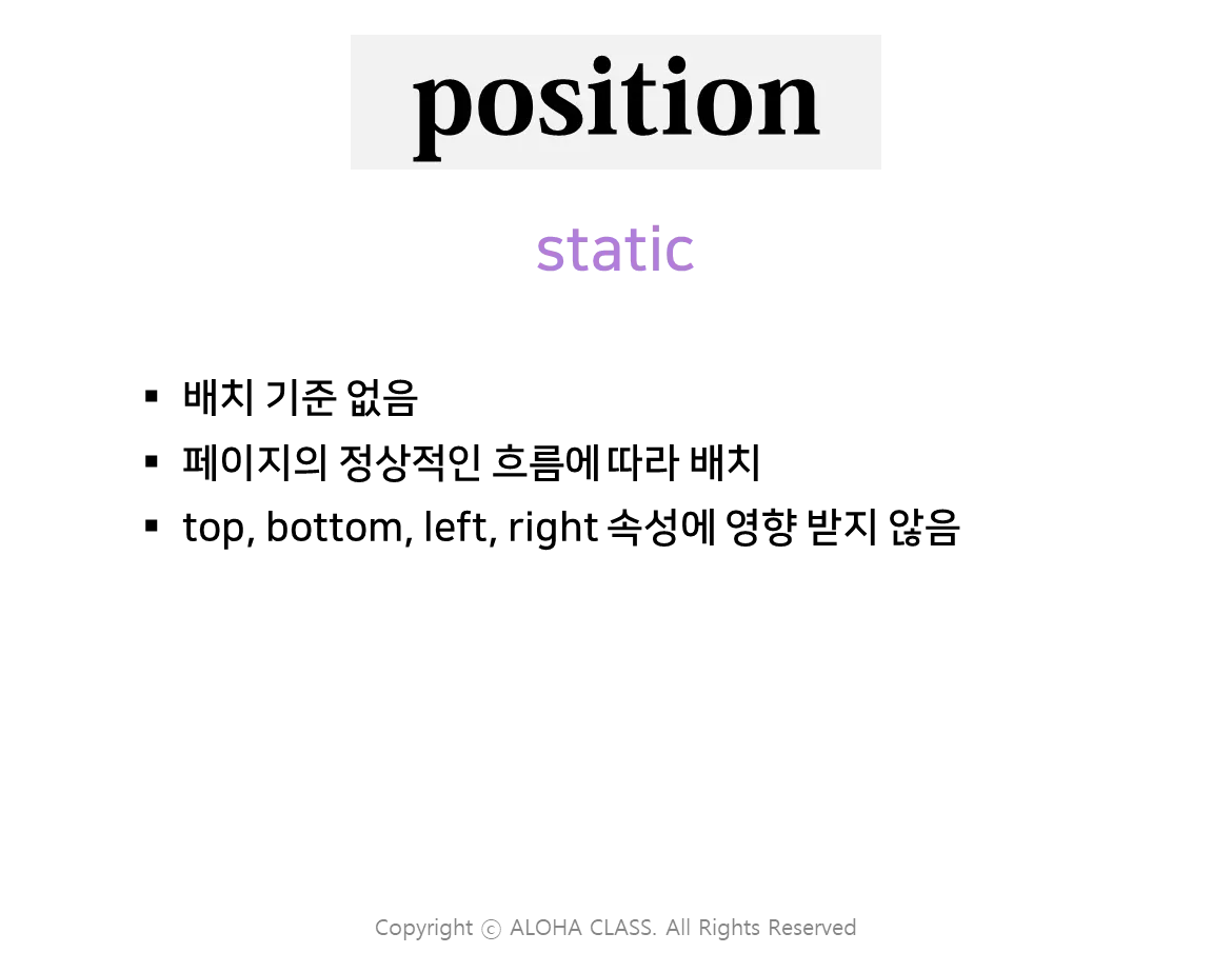
static
relative
•
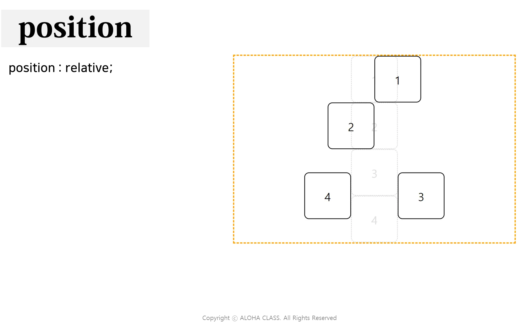
초기 위치를 기준으로 상대적으로 배치
•
top, bottom, left, right 로 지정한 길이만큼 초기 위치에서 떨어진 위치에 배치
•
HTML
<!DOCTYPE html>
<html lang="en">
<head>
<meta charset="UTF-8">
<meta name="viewport" content="width=device-width, initial-scale=1.0">
<title>position : relative;</title>
<link rel="stylesheet" href="css/01_relative.css">
</head>
<body>
<center><h1>position : relative;</h1></center>
<div class="container">
<!-- .relative*4{$} -->
<div class="relative first">1</div>
<div class="relative second">2</div>
<div class="relative third">3</div>
<div class="relative fourth">4</div>
<!-- .absolute*4{$} -->
<div class="absolute fifth">1</div>
<div class="absolute sixth">2</div>
<div class="absolute seventh">3</div>
<div class="absolute eighth">4</div>
</div>
</body>
</html>
HTML
복사
•
CSS
h1 { text-align: center; }
.container {
position: relative;
width: 1200px;
height: 800px;
border: 5px dashed orange;
margin: auto;
}
.container div {
margin: auto;
width: 200px;
height: 200px;
box-sizing: border-box;
text-align: center;
font-size: 48px;
line-height: 200px;
border-radius: 10%;
}
/* position : relative; */
.container .relative {
position: relative;
border: 3px solid black;
}
/* 초기위치 */
.container .absolute {
position: absolute;
border: 1px dashed #ddd;
color: #ddd;
z-index: -1;
}
/* relative */
.first { left: 100px; }
.second { right: 100px; }
.third { top: 100px; left: 200px; }
.fourth { bottom: 100px; right: 200px; }
/* absolute */
.fifth { top: 0; left: 500px; }
.sixth { top: 200px; left: 500px; }
.seventh { top: 400px; left: 500px; }
.eighth { top: 600px; left: 500px; }
CSS
복사
absolute
•
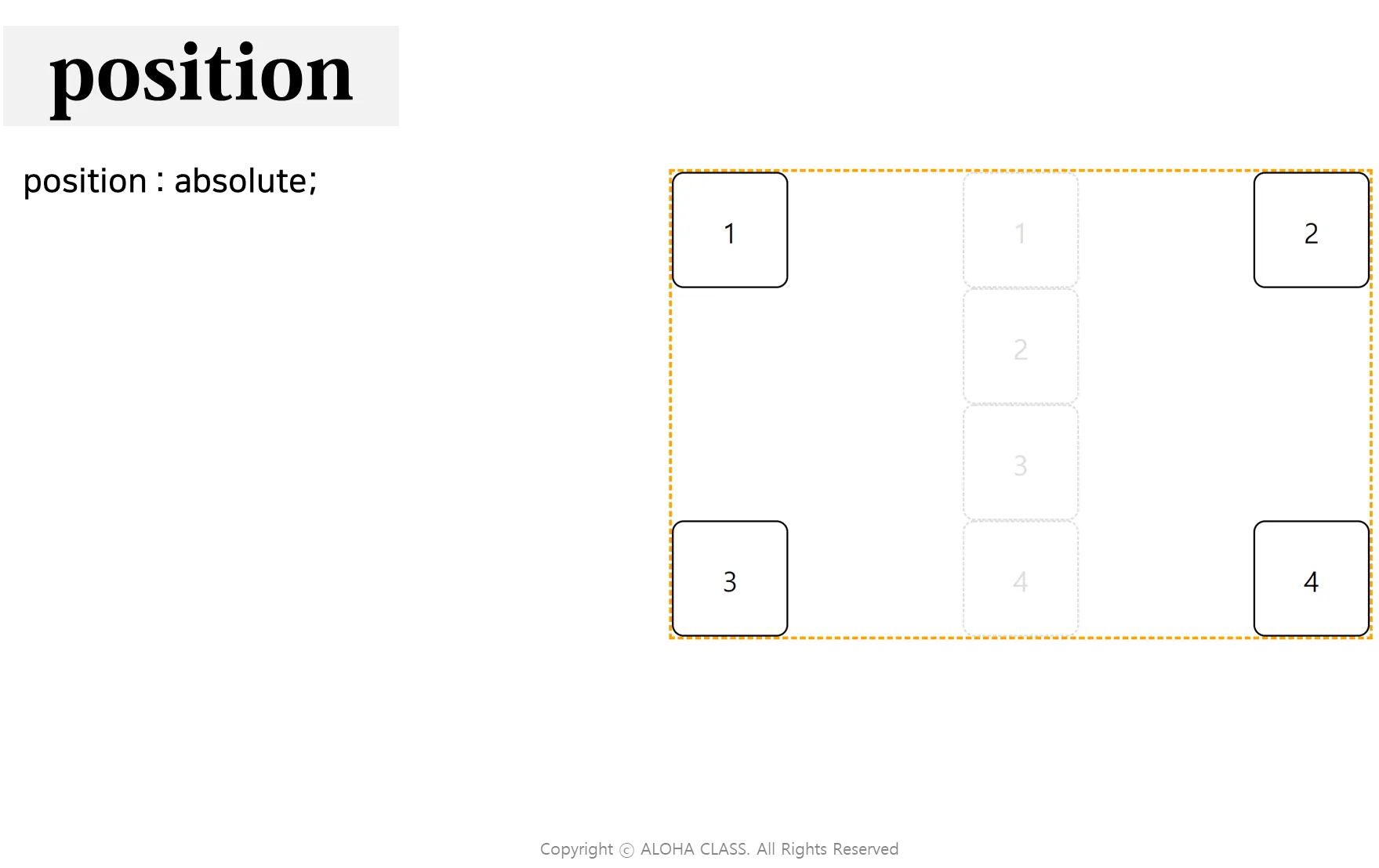
부모 요소를 기준으로 절대적인 위치로 배치
•
페이지의 정상적인 흐름에서 제외
•
다른 요소와 겹쳐져서(over-lap) 배치될 수 있음
•
top, bottom, left, right 로 지정한 길이만큼 부모 요소에서 떨어진 위치에 배치
•
HTML
<!DOCTYPE html>
<html lang="en">
<head>
<meta charset="UTF-8">
<meta name="viewport" content="width=device-width, initial-scale=1.0">
<title>position : absolute;</title>
<link rel="stylesheet" href="css/02_absolute.css">
</head>
<body>
<center><h1>position : absolute;</h1></center>
<div class="container">
<div class="absolute first">1</div>
<div class="absolute second">2</div>
<div class="absolute third">3</div>
<div class="absolute fourth">4</div>
<!-- 정가운데 -->
<div class="absolute center">CENTER</div>
<div class="base fifth">1</div>
<div class="base sixth">2</div>
<div class="base seventh">3</div>
<div class="base eighth">4</div>
</div>
</body>
</html>
HTML
복사
•
CSS
h1 { text-align: center; }
.container {
position: relative;
width: 1200px;
height: 800px;
border: 5px dashed orange;
margin: auto;
}
.container div {
margin: auto;
width: 200px;
height: 200px;
box-sizing: border-box;
text-align: center;
font-size: 48px;
line-height: 200px;
border-radius: 10%;
}
/* position : absolute; */
.container .absolute {
position: absolute;
border: 3px solid black;
}
/* 초기위치 */
.container .base {
position: absolute;
border: 1px dashed #ddd;
color: #ddd;
z-index: -1;
}
/* absolute */
.first { top: 0; left: 0; }
.second { top: 0; right: 0; }
.third { bottom: 0; left: 0; }
.fourth { bottom: 0; right: 0; }
/* base */
.fifth { top: 0; left: 500px; }
.sixth { top: 200px; left: 500px; }
.seventh { top: 400px; left: 500px; }
.eighth { top: 600px; left: 500px; }
/* 부모요소를 기준으로 정가운데 */
.center {
position: absolute;
top: 50%;
left: 50%;
transform: translate(-50%, -50%);
/* top, left : % 는 부모요소에 대한 비율 */
/* translate() : % 는 해당요소에 대한 비율 */
}
CSS
복사
fixed
•
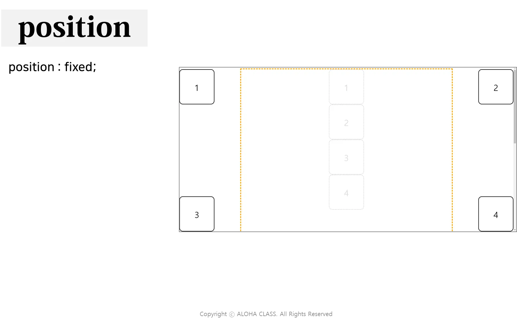
브라우저(뷰포트)를 기준으로 상대적인 위치로 배치
•
페이지를 스크롤해도 고정된 위치를 유지
•
top, bottom, left, right 로 지정한 길이만큼 페이지의 테두리에서 떨어진 위치에 배치
•
HTML
<!DOCTYPE html>
<html lang="en">
<head>
<meta charset="UTF-8">
<meta name="viewport" content="width=device-width, initial-scale=1.0">
<title>position : fixed;</title>
<link rel="stylesheet" href="css/03_fixed.css">
</head>
<body>
<center><h1>position : fixed;</h1></center>
<div class="container">
<div class="fixed first">1</div>
<div class="fixed second">2</div>
<div class="fixed third">3</div>
<div class="fixed fourth">4</div>
<!-- 정가운데 -->
<div class="fixed center">CENTER</div>
<div class="base fifth">1</div>
<div class="base sixth">2</div>
<div class="base seventh">3</div>
<div class="base eighth">4</div>
</div>
<div style="height: 2000px;"></div>
<div class="floating-btn">
버튼
</div>
</body>
</html>
HTML
복사
•
CSS
h1 { text-align: center; }
.container {
position: relative;
width: 1200px;
height: 800px;
border: 5px dashed orange;
margin: auto;
}
.container div {
margin: auto;
width: 200px;
height: 200px;
box-sizing: border-box;
text-align: center;
font-size: 48px;
line-height: 200px;
border-radius: 10%;
}
/* position : fixed; */
.container .fixed {
position: fixed;
border: 3px solid black;
}
/* 초기위치 */
.container .base {
position: absolute;
border: 1px dashed #ddd;
color: #ddd;
z-index: -1;
}
/* absolute */
.first { top: 0; left: 0; }
.second { top: 0; right: 0; }
.third { bottom: 0; left: 0; }
.fourth { bottom: 0; right: 0; }
/* base */
.fifth { top: 0; left: 500px; }
.sixth { top: 200px; left: 500px; }
.seventh { top: 400px; left: 500px; }
.eighth { top: 600px; left: 500px; }
/* 부모요소를 기준으로 정가운데 */
.center {
position: absolute;
top: 50%;
left: 50%;
transform: translate(-50%, -50%);
/* top, left : % 는 부모요소에 대한 비율 */
/* translate() : % 는 해당요소에 대한 비율 */
}
/* 플로팅 버튼 */
.floating-btn {
position: fixed;
right: 50px;
bottom: 250px;
background-color: red;
border-radius: 50%;
width: 100px;
height: 100px;
line-height: 100px;
color: white;
text-align: center;
font-size: 30px;
cursor: pointer;
}
CSS
복사
sticky
•
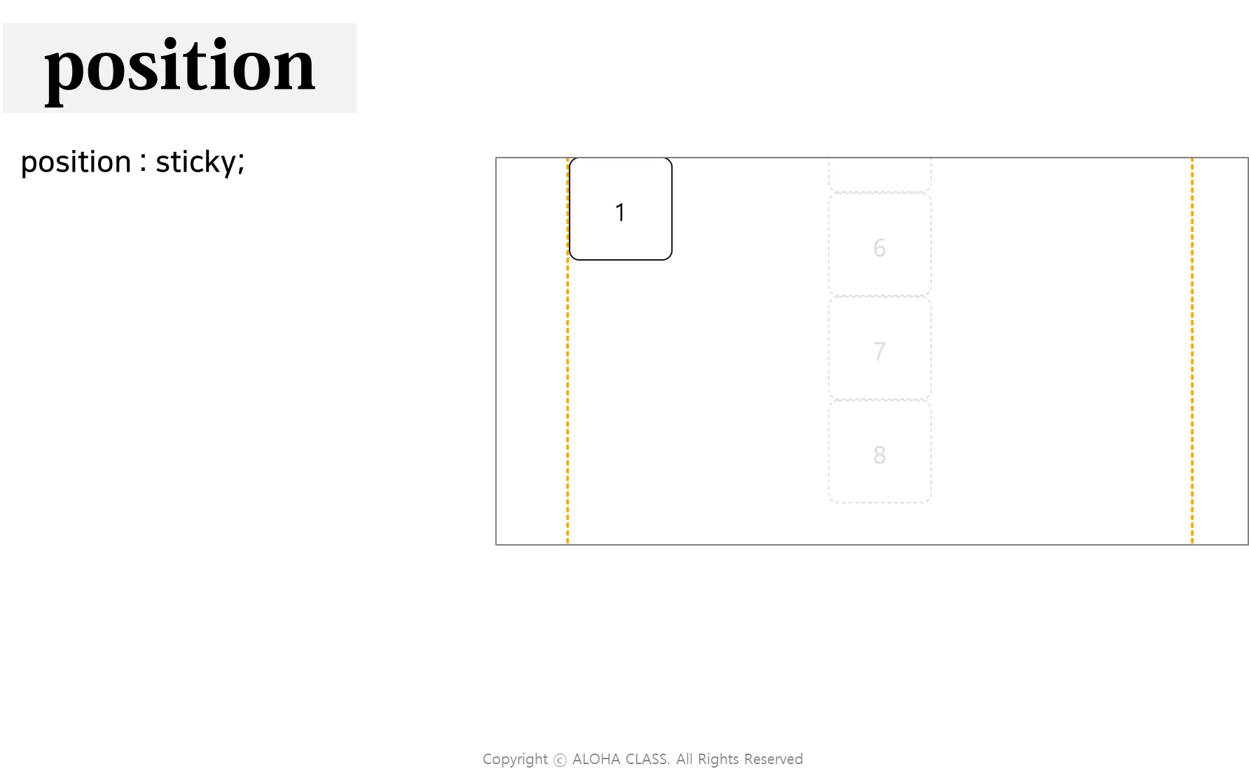
스크롤 위치를 기준으로 배치
•
스크롤 위치
•
페이지 시작~요소의 위치 : relative
•
그 이후 : fixed
•
IE 에서는 지원하지 않음
•
Safari 에서는 –webkit- prefix 가 필요함
•
HTML
<!DOCTYPE html>
<html lang="en">
<head>
<meta charset="UTF-8">
<meta name="viewport" content="width=device-width, initial-scale=1.0">
<title>position : sticky;</title>
<link rel="stylesheet" href="css/04_sticky.css">
</head>
<body>
<center><h1>position : sticky;</h1></center>
<div class="container">
<div class="box"></div>
<header>HEADER</header>
<div class="box"></div>
<div class="sticky first">1</div>
<div class="sticky second">2</div>
<div class="sticky third">3</div>
<div class="sticky fourth">4</div>
<div class="base fifth">1</div>
<div class="base sixth">2</div>
<div class="base seventh">3</div>
<div class="base eighth">4</div>
</div>
<div style="height: 2000px;"></div>
</body>
</html>
HTML
복사
•
CSS
h1 { text-align: center; }
.container {
position: relative;
width: 1200px;
height: 3000px;
border: 5px dashed orange;
margin: auto;
}
.container div {
margin: auto;
width: 200px;
height: 200px;
line-height: 200px;
box-sizing: border-box;
text-align: center;
font-size: 48px;
border-radius: 10%;
}
/* position : sticky; */
.container .sticky {
position: sticky;
border: 3px solid black;
}
/* 초기위치 */
.container .base {
position: absolute;
border: 3px dashed #ddd;
color: #ddd;
z-index: -1;
}
/*
스크롤 영역 안 : relative
스크롤 영역 밖 : fixed
*/
/* sticky */
.first { top: 100px; float: left; }
.second { top: 100px; float: left; }
.third { top: 100px; float: right; }
.fourth { top: 100px; float: right; }
/* base */
.fifth { top: 0; left: 500px; }
.sixth { top: 200px; left: 500px;}
.seventh { top: 400px; left: 500px;}
.eighth { top: 600px; left: 500px;}
.center {
position: fixed;
top: 50%;
left: 50%;
transform: translate(-50%, -50%);
/* top, left 의 % 는 부모요소에 대한 비율 */
/* translate() 의 % 는 해당요소에 대한 비율 */
/* translate( x축, y축 ) */
}
header {
position: sticky;
top: 0;
left: 0;
width: 100%;
height: 80px;
background-color: cornflowerblue;
color: white;
font-size: 40px;
text-align: center;
line-height: 80px;
}
.box {
width: 1200px !important;
height: 300px !important;
margin-top: 80px;
border-radius: 0 !important;
background-color: royalblue;
}
CSS
복사
기본 예시 코드
<!DOCTYPE html>
<html lang="ko">
<head>
<meta charset="UTF-8">
<meta name="viewport" content="width=device-width, initial-scale=1.0">
<title>위치 속성 예시</title>
<style>
/* 기본 스타일 설정 */
body {
margin: 0;
font-family: Arial, sans-serif;
height: 100vh;
display: flex;
justify-content: center;
align-items: center;
background-color: #f0f0f0;
}
/* 위치 속성 예시 */
.container {
position: relative;
width: 200px;
height: 200px;
background-color: lightblue;
}
.box {
position: absolute;
width: 100px;
height: 100px;
background-color: coral;
top: 20px; /* 상단에서 20px 위치 */
right: 20px; /* 우측에서 20px 위치 */
z-index: 10; /* 쌓임 순서, 값이 클수록 위에 표시됨 */
}
</style>
</head>
<body>
<div class="container">
<div class="box"></div>
</div>
</body>
</html>
HTML
복사
위치 속성 활용
•
정가운데 위치 지정
•
고정 헤더
•
스티키 헤더
•
플로팅 버튼
정가운데 위치 지정
부모 요소 또는 브라우저 요소 기준 가운데 위치하도록 설정해봅니다.
<!DOCTYPE html>
<html lang="ko">
<head>
<meta charset="UTF-8">
<meta name="viewport" content="width=device-width, initial-scale=1.0">
<title>정가운데 위치</title>
<style>
body {
margin: 0;
height: 100vh;
display: flex;
justify-content: center;
align-items: center;
background-color: #f0f0f0;
}
.centered {
width: 200px;
height: 100px;
background-color: lightcoral;
text-align: center;
line-height: 100px;
color: white;
}
</style>
</head>
<body>
<div class="centered">중앙 위치</div>
</body>
</html>
HTML
복사
고정 헤더
페이지를 스크롤 하여도, 헤더가 상단에 고정되도록 합니다.
<!DOCTYPE html>
<html lang="ko">
<head>
<meta charset="UTF-8">
<meta name="viewport" content="width=device-width, initial-scale=1.0">
<title>고정 헤더</title>
<style>
body {
margin: 0;
font-family: Arial, sans-serif;
}
header {
position: fixed;
top: 0;
left: 0;
width: 100%;
background-color: #333;
color: white;
padding: 15px;
text-align: center;
z-index: 1000;
}
.content {
margin-top: 60px; /* 헤더 높이만큼 여백 추가 */
padding: 20px;
}
</style>
</head>
<body>
<header>고정 헤더</header>
<div class="content">
<p>스크롤하여 내용을 확인하세요.</p>
<p>많은 내용이 들어가면 헤더는 계속 상단에 고정됩니다.</p>
</div>
<div style="height: 5000px;"></div>
</body>
</html>
HTML
복사
스티키 헤더
스크롤 시 스티커처럼 달라붙어 고정되는 헤더를 만들어봅니다.
<!DOCTYPE html>
<html lang="ko">
<head>
<meta charset="UTF-8">
<meta name="viewport" content="width=device-width, initial-scale=1.0">
<title>스티키 헤더</title>
<style>
body {
margin: 0;
font-family: Arial, sans-serif;
}
header {
position: sticky;
top: 0;
background-color: #444;
color: white;
padding: 15px;
text-align: center;
z-index: 1000;
}
.content {
height: 2000px; /* 충분한 스크롤을 위해 높이 설정 */
padding: 20px;
}
</style>
</head>
<body>
<header>스티키 헤더</header>
<div class="content">
<p>스크롤하여 헤더의 스티키 효과를 확인하세요.</p>
</div>
</body>
</html>
HTML
복사
플로팅 버튼
페이지 우측 하단에 떠있는 버튼을 만들어봅니다.
<!DOCTYPE html>
<html lang="ko">
<head>
<meta charset="UTF-8">
<meta name="viewport" content="width=device-width, initial-scale=1.0">
<title>플로팅 버튼</title>
<style>
body {
margin: 0;
font-family: Arial, sans-serif;
}
.floating-button {
position: fixed;
bottom: 20px;
right: 20px;
width: 60px;
height: 60px;
background-color: #007bff;
color: white;
border-radius: 50%;
display: flex;
justify-content: center;
align-items: center;
font-size: 24px;
box-shadow: 0 4px 8px rgba(0, 0, 0, 0.3);
cursor: pointer;
}
</style>
</head>
<body>
<div class="floating-button">+</div>
</body>
</html>
HTML
복사